Moo Moo
The Brand
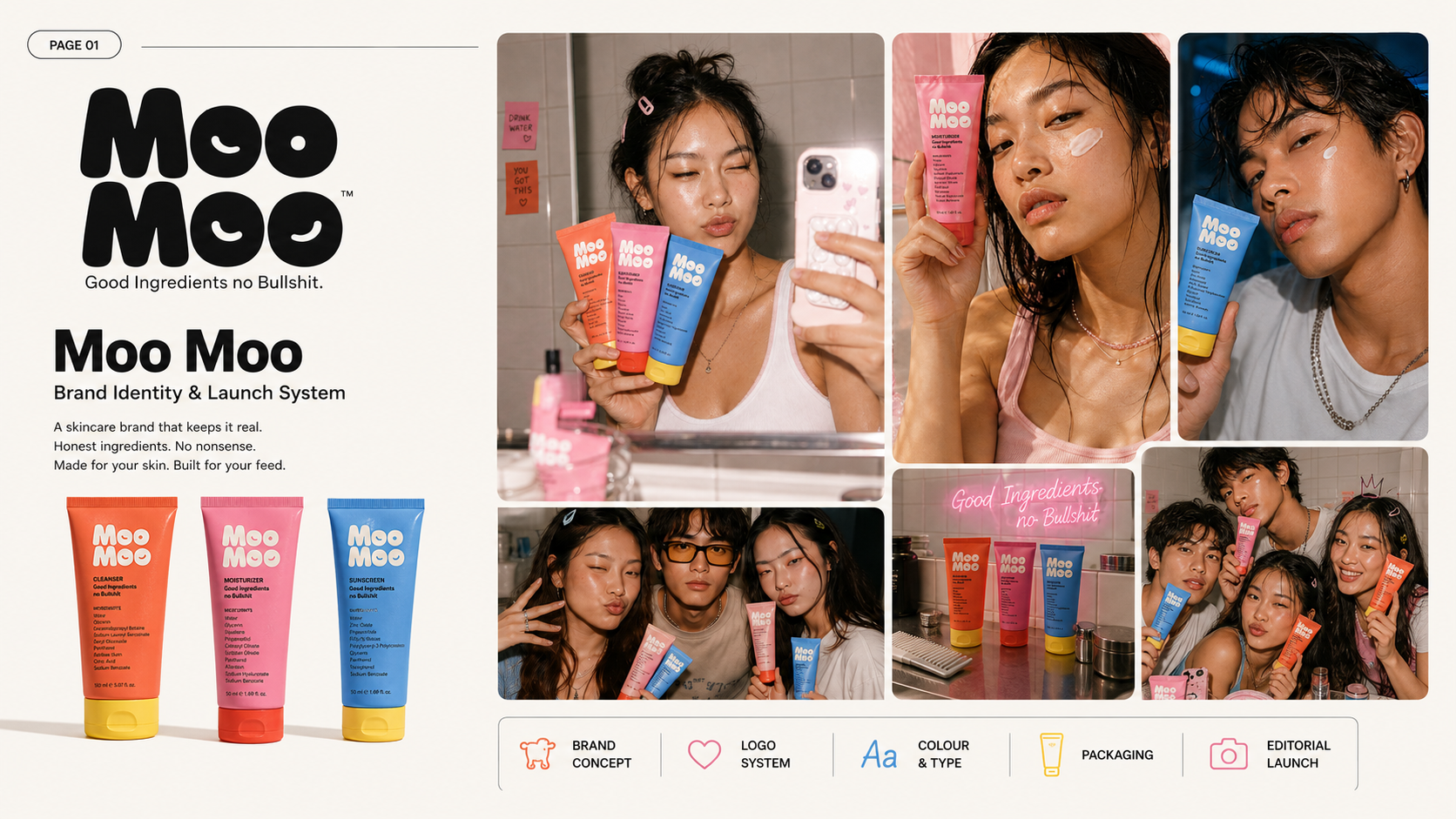
Moo Moo is a Gen Z skincare brand built for people starting their first real skincare routine.
The idea was simple: skincare should not feel like a chemistry exam, a 10-step drama, or another brand screaming “clean beauty” without explaining anything.
Moo Moo was built around three essential steps:
Cleanse. Hydrate. Protect.
Clear ingredients. Loud packaging. No overcomplication.
The Brief
The brand needed an identity that felt young, honest, skincare-first and instantly memorable.
It had to speak to a 16–27 audience that discovers brands on Instagram, TikTok-style content, packaging reels, shelfies, creator recommendations and unboxing-led content.
The challenge was to make Moo Moo feel playful and social-first without making it look childish or unserious.
The Visibility Problem
Most skincare brands either look too clinical or too aesthetic with nothing real to say.
Moo Moo needed to stand out in a crowded skincare market with a brand language that was clear, bold and easy to remember.
The goal was not just to make the brand look cute.
The goal was to make the brand easy to understand, easy to photograph, easy to recommend and easy to choose for Gen Z’s first skincare routine.
What Sochh Did
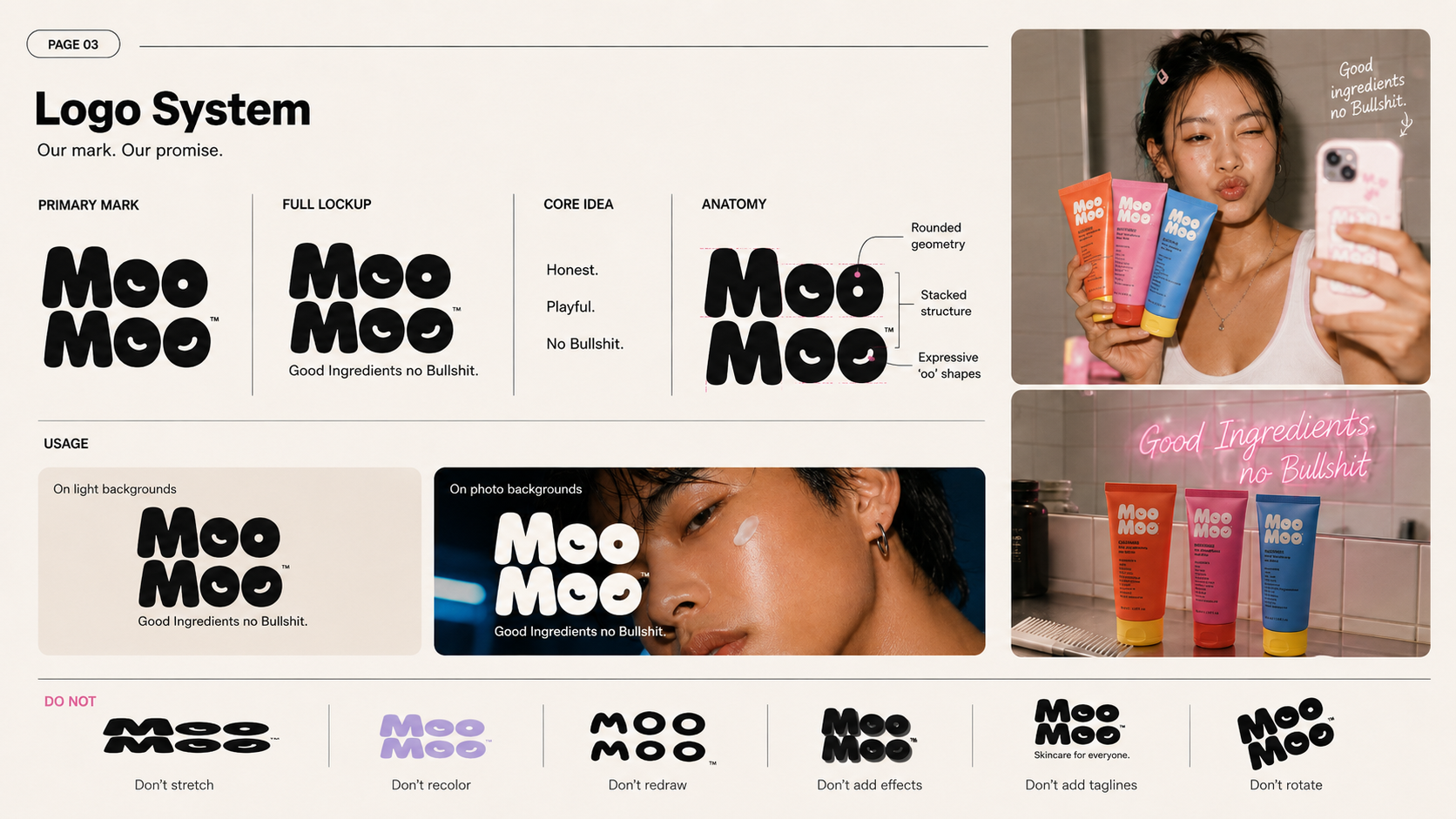
Sochh built the brand’s identity and launch direction from the ground up.
We worked on the brand strategy, positioning, logo system, colour language, typography, packaging direction, editorial shoot style, launch creatives and social media content structure.
The complete brand world was designed to feel loud, honest, ingredient-aware and made for digital discovery.
Brand Strategy
The core positioning was built around:
Good Ingredients. No Bullshit.
The brand was shaped around clarity, transparency and confidence. Moo Moo did not need to sound like a luxury skincare label trying too hard. It needed to sound like a smart best friend who knows what works and does not have time for skincare nonsense.
Visual System
The identity was built with a bold, youthful and shelf-friendly visual language.
Key brand cues included:
Custom Moo Moo wordmark
Colour-coded skincare routine
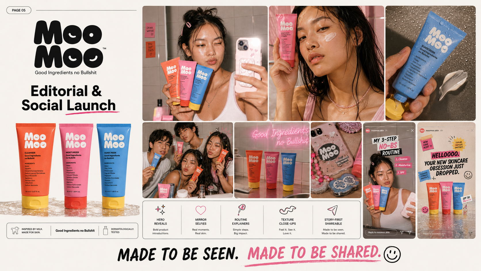
Coral for cleanser
Pink for moisturiser
Blue for sunscreen
Near-black and off-white neutrals
Doodle-led graphic details
Flash photography
Dewy real skin
Bathroom and mirror moments
Editorial + UGC-style visuals
The brand was designed to look strong across packaging, Instagram posts, reels, stories, website banners, creator content and launch visuals.
Content Direction
The launch content system was planned around skincare education, product clarity and social-first storytelling.
Content pillars included:
Starter skincare routine
Ingredient transparency
Cleanse, hydrate, protect education
Packaging-led reels
Unboxing content
Skincare myths
Real skin visuals
Friendship and bathroom-shelf moments
Short-form product explainers
Launch campaign posts and stories
Outcome
Sochh helped Moo Moo move from a product idea to a complete brand world.
The result was a skincare identity that felt bold, clear, social-first and built for recall — from logo and packaging to launch creatives and content direction.
Moo Moo was not designed to blend into the skincare shelf.
It was designed to be picked up, photographed, talked about and remembered.
Other Stories